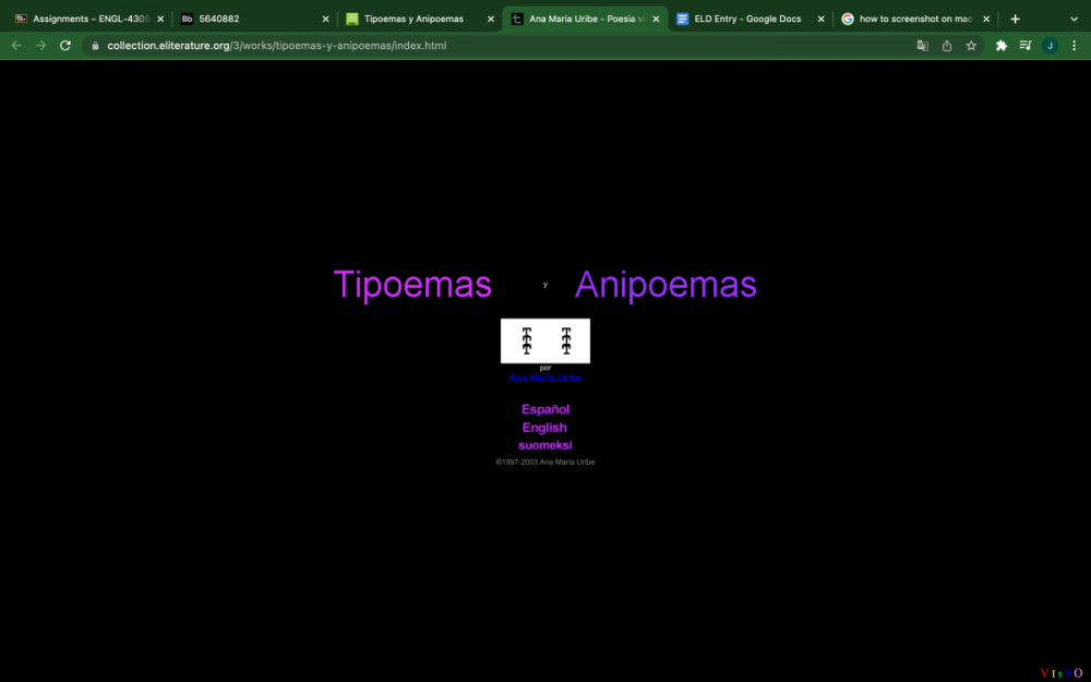
Ana Maria Uribe's digital poetry animations, encompassed under the term Tipoemas y Anipoemas, depict various themes in a minimalist manner. Uribe's typographic poetry is available in English and Spanish and was originally produced via a Lettera 22 typewriter. She was able to do so with great skill and precision, lining up the paper and ink ribbon perfectly to create their art. According to Etymonline, the word typography comes from the Greek words typos (impression) and graphia (writing). Tipoemas y Anipoemas is a work of writing that makes an impression on readers. The inclusive nature of the project allows a multitude of individuals to enjoy and analyze Uribe's work.
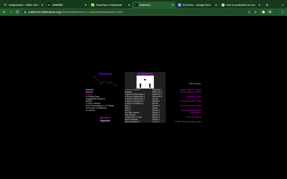
Uribe's original Tipoemas offer examples of how these poems would have appeared prior to 1997 when she began using a computer. As they were initially published in Spanish, the letter sequences in many poems create Spanish words that add to the poem's meaning. For example, the phrase "tren en marcha" or "moving train" is repeated within the poem A Train in Motion. Uribe uses the letter sounds, position, and number to mimic the experience of a real-life train in motion. This pattern repeats itself within many of the poems within the project's Tipoemas and Anipoemas sections.
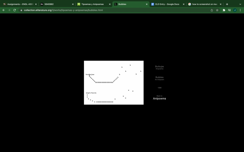
The power of digital literature allowed them to evolve their talent and animate these poems to showcase their full effect. Uribe uses animation to personify and give life to their poetry. In doing so, they are able to move away from using full words and begin manipulating an assortment of letters and characters through motion in their Anipoemas. To a higher degree than the Tipoemas, these allow viewers to create their own interpretation of the text before seeking clarification in the poem's title. The motion applied to each poem forces the mind to choose an experience that resembles Uribe's depiction and piece together any connections between the two. Each Anipoema offers excellent examples of minimalistic thinking that translates into detailed, realistic thought and personal association.
Tipoemas y Anipoemas is interesting because it allows the reader to enjoy both close and distant readings of each poem. In closely analyzing each piece, one can understand the more profound, poetic meaning behind it. In contrast, distant readings allow them to enjoy the peaceful movement and visual art of the piece. These pieces are also an evolutionary aspect of digital literature. The typography produced by Ana Maria Uribe in this project has been performed in print since before the Renaissance era's invention of the printing press. The capabilities of digital humanities have simply revolutionized the art of writers like Uribe and allowed broader access to their work.
The way in which Uribe utilizes their abilities in combination with word processing technologies is particularly stimulating as they do not only work in plain, black and white text. They take advantage of different fonts and colour schemes; for example Dry Red Leaves uses various colours associated with autumn leaves. Uribe’s artistic incorporation of colour and style furthers the overall experience of their animated poetry. Overall Tipoemas y Anipoemas is a unique form of digital poetry appealing to various audiences for multiple purposes.